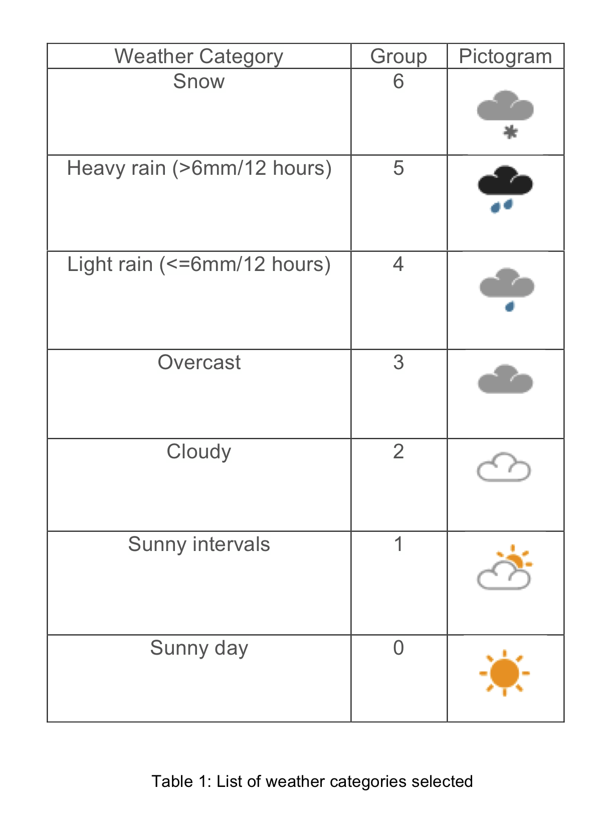
Below are a collection of graphs illustrating the relationship between a number of the variables assessed in the project against patient demand. Due to space not all of the graphs could be included in the final poster design.
Figure 1.
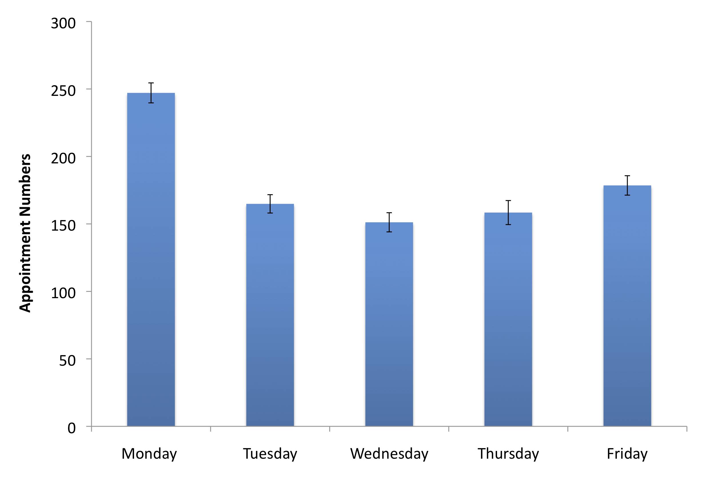
Figure 2.

Figure 3.
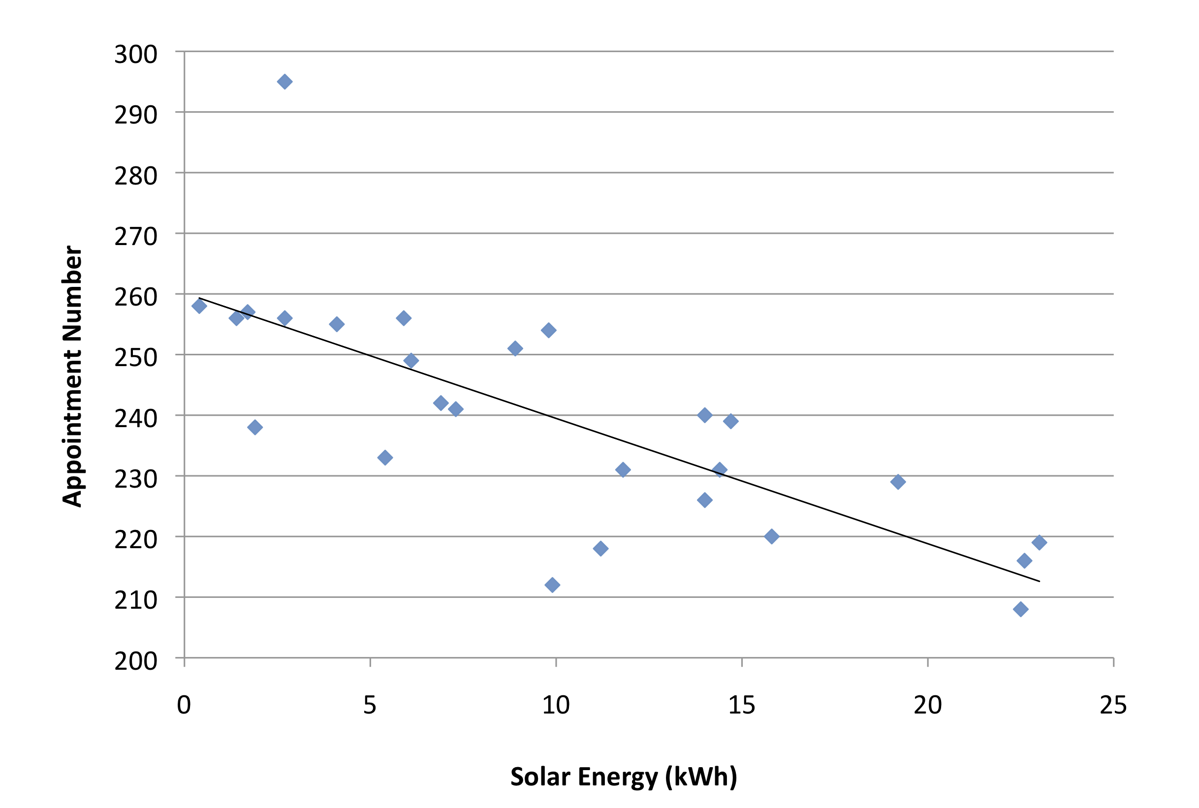
Figure 4.
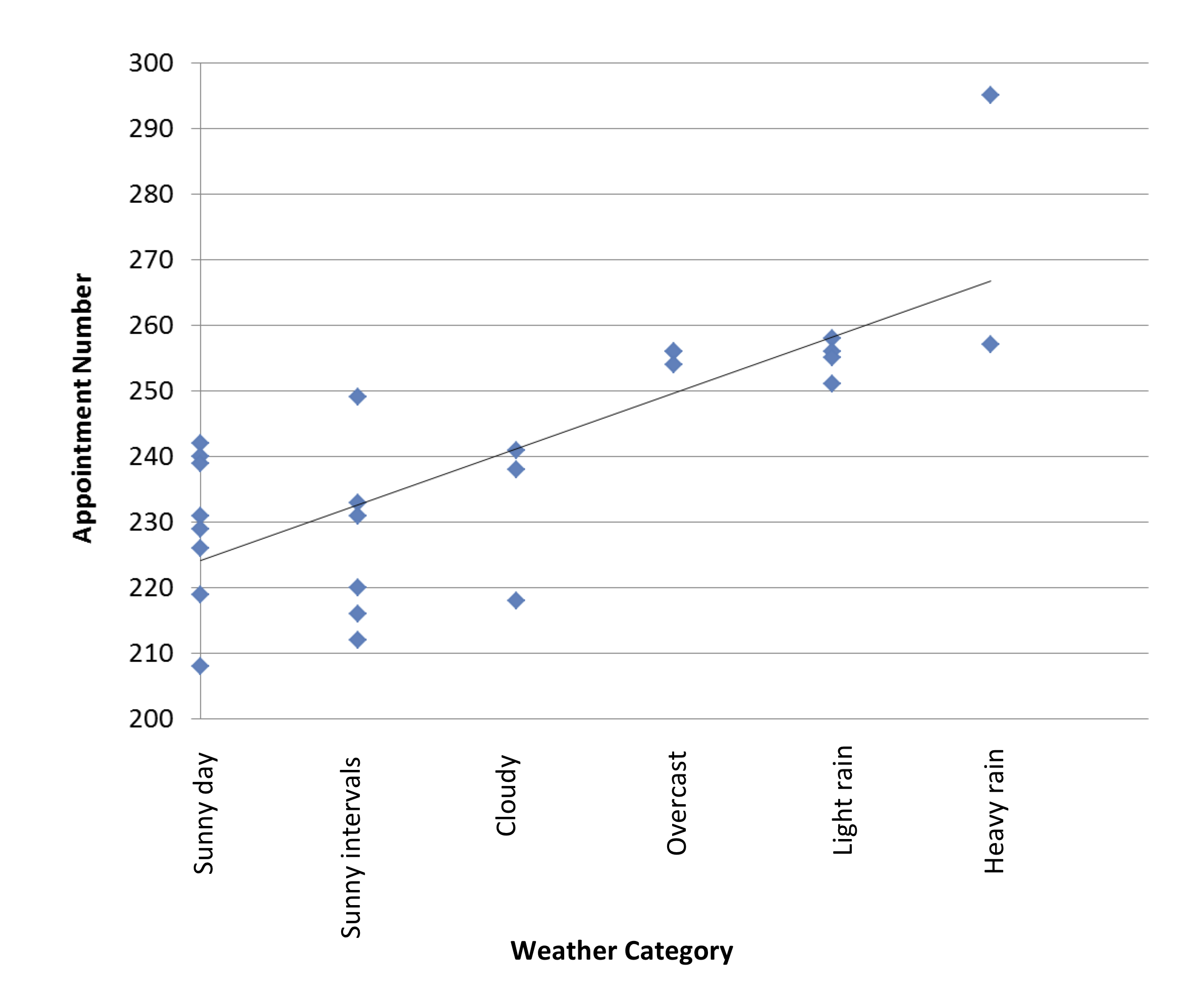
Figure 5.
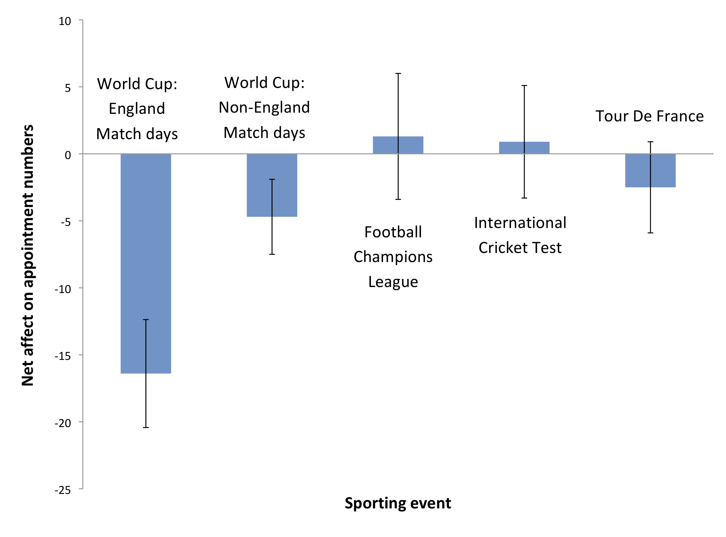
Figure 6.
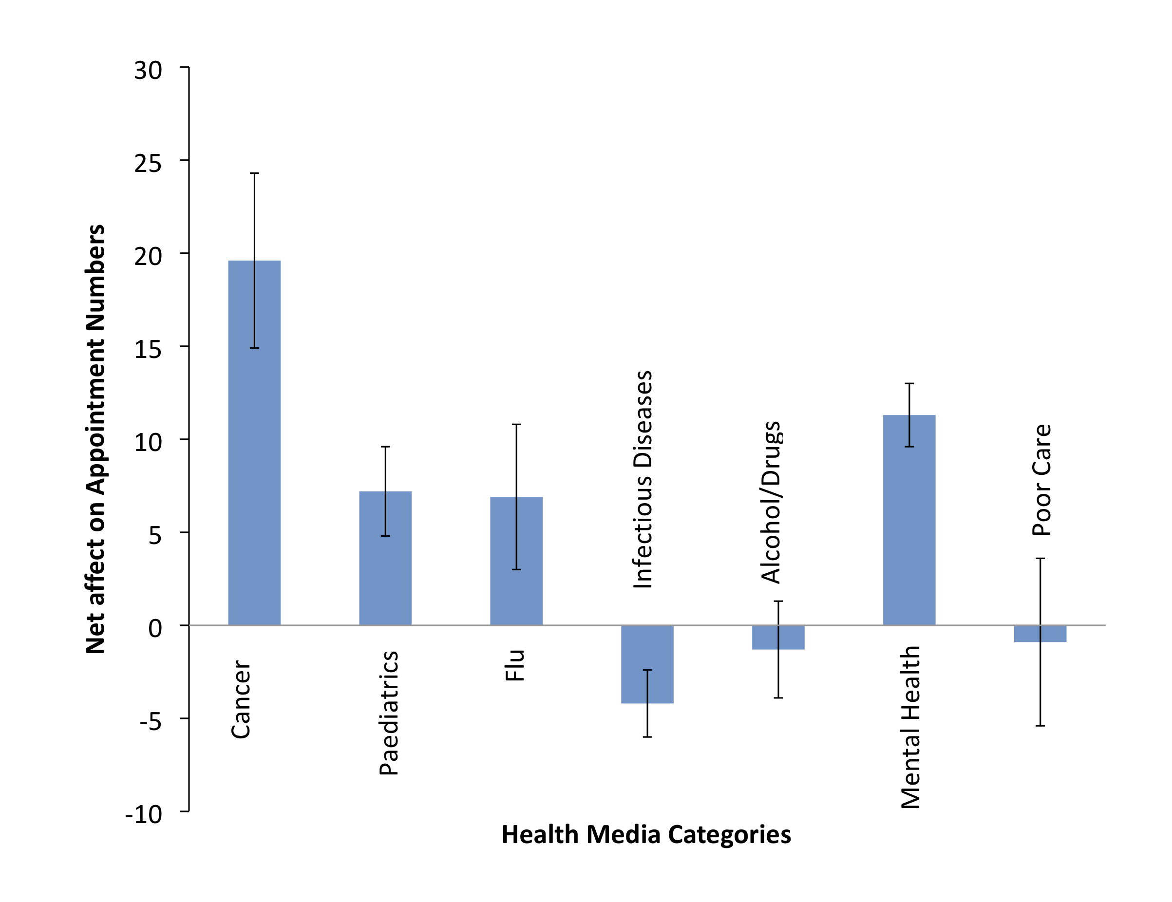
Table 1.